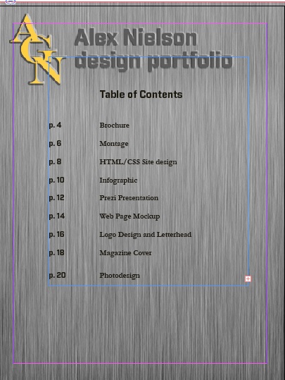
The Table of Contents page on the ShareFile document is glitchy. At the bottom of the page, the text fluctuates in size and in font. I tried uploading the project several times, but for some reason this error remained consistent. This is how it looks on the InDesign document I created.
PROJECT CORRECTIONS/TIME SPENT
I spent two hours and forty-five minutes making changes to the magazine cover project and the webpage mockup project
DESCRIPTION
Design a portfolio that showcases all projects from my Visual Media course.
MESSAGE
Showcasing my work in a professional medium
PROCESS
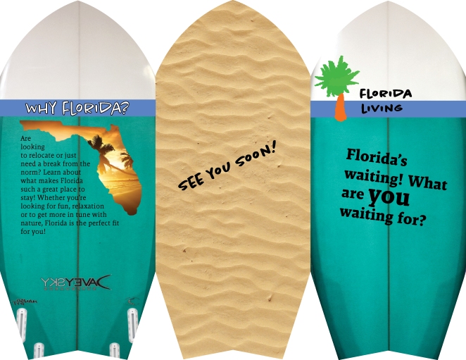
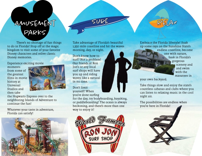
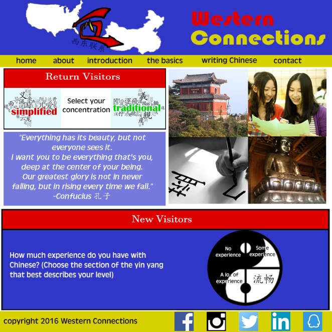
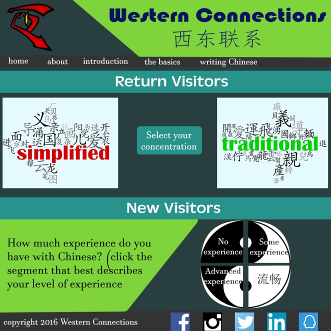
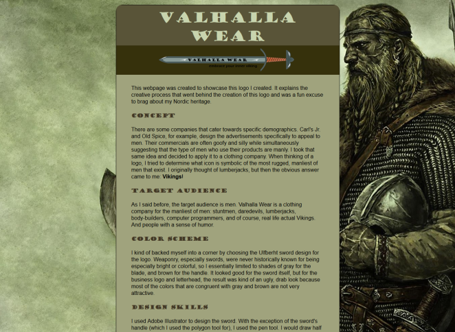
I had an idea of what I wanted to do for the portfolio design. I’d found a number of backgrounds with interesting textures and colors which I wanted to use. However, when I designed the logo (AGN Designs) and accompanying header, I realized that it wasn’t a conducive design. I liked the logo better than I liked the backgrounds, so I ended up changing the background to fit the gold color and the font of the logo I had created. The background I ended up choosing was a plate of brushed steel. I adjuste the fonts to of the header and contact page to make it look like the lettering was either coming upward out of the metal or was carved into the metal itself. I exported it as a jpeg where I placed the design into InDesign and added the project description text.
CRITIQUES
I posted my portfolio’s design to Facebook. Amanda Peck pointed out that the font was kind of big and suggested changing it to smaller font, which I did and which I think looked a lot better than the larger typeface. I also met with Kent Roper on Google Hangouts on Tuesday night for a one-on-one critique session. He suggested cropping out the left side of the HTML/CSS styling page so that the text would be move visible and so that there wouldn’t be so much space devoted to what was essentially unnecessary white space. I took that advice and I think it helped the design. It’s slightly asymmetrical now but I think it makes it easier to see the content on the page. Also, although Kent didn’t make this suggestion, I noticed the layout of his text was arranged in a way that each element was static in position, irrespective of the other text, so I rearranged my own text for a similar effect.
AUDIENCE
Potential employers
TOP THING LEARNED
Creating any kind of visual media content requires planning and organization prior to starting
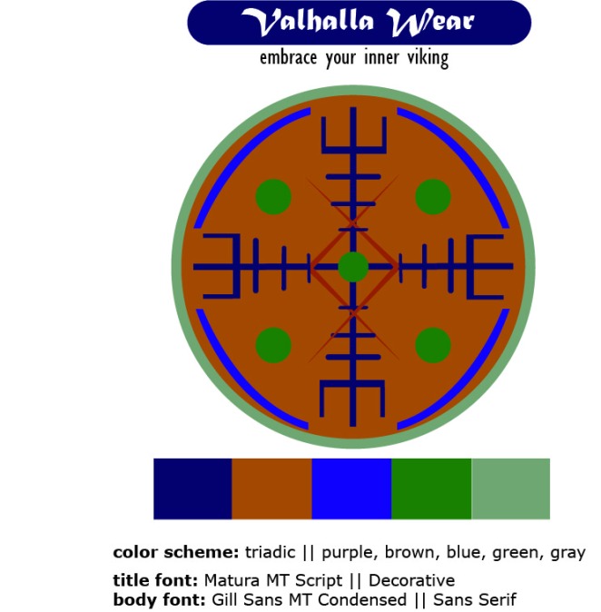
COLOR SCHEME & COLOR NAMES
Monochromatic plus complementary || Gold and purple-gray
TITLE FONT NAME & CATEGORY
Industry // Sans Serif
COPY FONT NAME & CATEGORY
Garamond // Serif
THUMBNAILS OF ANY ORIGINAL, UNEDITED IMAGE(S) USED IN THE PROJECT
All images located in portfolio
SOURCE OF EACH IMAGE (website name and hyperlink)
All of the images are original content created by me
EMBED YOUTUBE VIDEO


")


