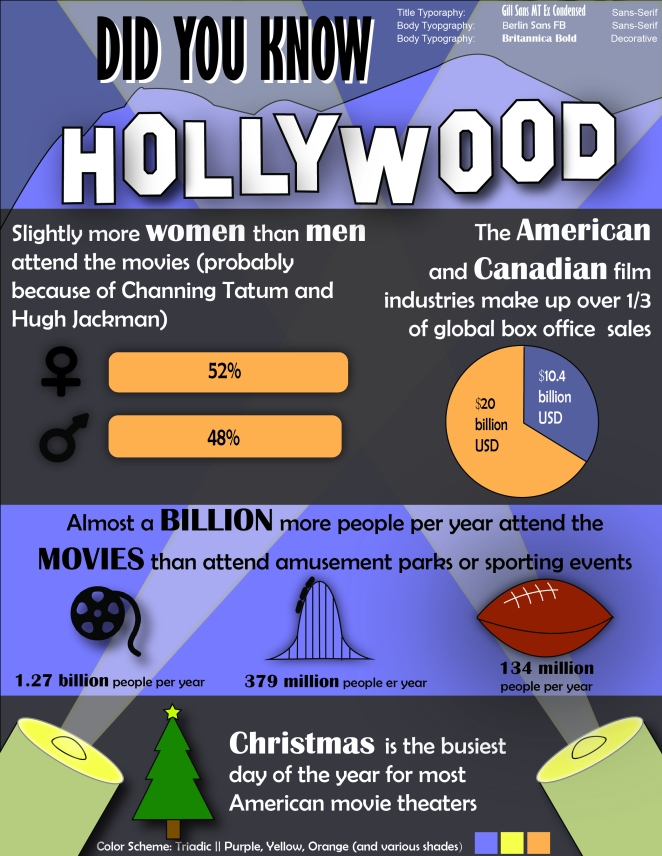
1. Description: Create an infographic that organizes data in a visually pleasing way
2. Process (Programs, Tools, Skills, FOCUS principles):
- I decided on a subject that I thought would make an interesting topic for an infographic (movies/the film industry)
- I then thought of a catchy header that would grab the audience’s attention. I decided to model it after the Hollywood Video logo
- Once I decided on that logo, I chose a triadic color scheme that was reminiscent of the logo’s
- I created a purple rectangle for the background and used a different shade of purple with the pen tool to create the mountains
- I used the text took to write “DID YOU KNOW” in black text, then copied the text, changed the coloring to white, and then placed it behind the black text and slightly unaligned to make it look more visible
- I then found an image of the Hollywood video logo, uploaded it to Illustrator, and then used the pen tool to trace out the the letters, highlighted the letters, and grouped them together to form a single unit
- I used elliptical shape tool to make the lenses and bulbs of the searchlights and another rounded rectangle shape for the body of the searchlight. For the lenses of the searchlight, I went to effects > stylize, and adjusted the inner glow to give it more of a luminescent look. I added an elongated trapezoid shape for the light beams and adjusted the opacity as well as their position in the layering of the different elements so that it overlapped some elements while passing behind others. For each searchlight and the beam of light, I selected all of the individual components and grouped them together so they would be adjusted as a single image
- I then decided on typography for the title, the body, and emphasized words in the body
- I made used the shape tool and made circles and rounded rectangles for the male and female symbols, a well as the pie graph. I changed the stroke thickness of the gender symbols to give them a thicker, more stylized effect, and used the “create shape” tool to merge all the pieces together into a new shape
- I created simple black rectangle for the backdrop of the gender statistics and Canada/US statistics
- I actually didn’t create the film reel image. It was too difficult, so I found a free usage one on Google and copy/pasted it in and adjusted the size. I used the pen tool to draw the roller coaster track by making one half, copying it, and reversing the image so that the track would be symmetrical. I then used the rectangle tool to make the cars on the track. I used the pen tool and the line tool for the football and then used the text tool to add all of the statistics beneath them
- I used the polygon tool to make a star for the tree. I then made three overlapping triangles for the body of the tree and a brown rectangle for the trunk. I highlighted all the pieces and grouped them together to form one image
- I then created a final black rectangle to serve as a backdrop for the bottom section of the infographic and arranged the layering so that it was in front of the mountains but behind the tree, the text, and the searchlights
- In the final step, I went back and added a drop shadow to all of the elements that I thought would benefit from a more 3D look
3. Critique Report: I watched Brother Stucki’s critique and took his advice on how to hollow out the “O’s” in Hollywood, adjust the typography to a more readable font, and to emphasize different words to make it pop out more. I then met with Mike Summers over Google Hangouts who suggested that I might want to try making the gender symbols white instead of black. I tried that but ultimately decided that the contrast between black symbols beneath white text looked better.
4. Message: no real profound message here, just a little bit of fun information that most people might not know about the movie industry
5. Audience: people who enjoy movies and/or Hollywood
6. Top Thing Learned: how much easier it was to find a direction when appropriately planning things beforehand. Doing the sketches and choosing a color scheme were a little bit time consuming, maybe 30-40 minutes, but it ended up saving even more time of just experimenting with unclear ideas
7. Color scheme and color names: Triadic || purple, yellow, orange
8. Title Font Name & Category: Gill Sans MT Ex Condensed || Sans-serif
9. Copy Font Name & Category: Berlin Sans FB || Sans-serif; Britannica Bold || Decorative
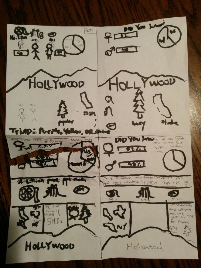
10. Thumbnails of any original, unedited image used in the project:
My own sketches

11. Source of each image (website name and hyper link):
Black film reel image: https://www.google.com/url?sa=i&rct=j&q=&esrc=s&source=images&cd=&ved=0ahUKEwj3756ei5rNAhUKKiYKHdppCrIQjBwIBA&url=http%3A%2F%2Fwww.iconsplace.com%2Fdownload%2Fblack-film-reel-256.png&psig=AFQjCNFHtTuSYjg0Um07g0O16HBZpeN8Yg&ust=1465532255503600&cad=rjt
Film industry information: http://www.mpaa.org/wp-content/uploads/2015/03/MPAA-Theatrical-Market-Statistics-2014.pdf
12. Embed video of printed project

Looks awesome. I really like the search lights and the Hollywood logo. The drop shadows add a lot too, without being too obvious.
I agree with you about this being a very time-consuming project, but also very gratifying. I have a love/hate relationship with this class. It’s a ton of work but I feel it’s been one of the more useful classes I’ve taken.
My project: http://kent.is.a.comm130.ninja/2016/06/08/infographic/
Kari’s project: https://karimathiasmedia.wordpress.com/2016/06/09/infographic-project/
LikeLike
I agree with you that this project was time consuming and a lot of work, but it was worth it. Your infographic turned out well, and I like the spot lights in the image. I also like the Hollywood sign and am glad you were able to figure out how to remove the middle of the letters. It was fun reading your infographic and learning more about films and just how big they really are.
My Blog:
Zachary Powell’s Blog
LikeLike